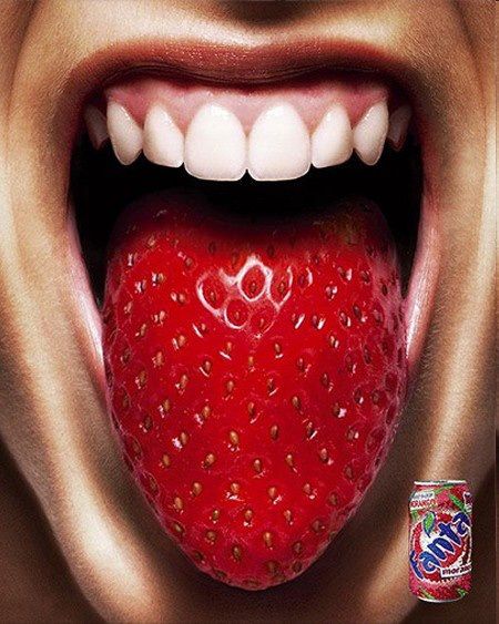
I chose this ad because I liked that it was creative but also sent a message. This product is so good your tongue will taste the fruity flavor. I feel like it was a good use of design and creativity. The design of this ad has many different great design elements. It uses repetition inContinue reading “Reverse Engineer Fanta Ad Campaign”
Category Archives: design
A is for Apple…. a beginners critique of typography and photography.
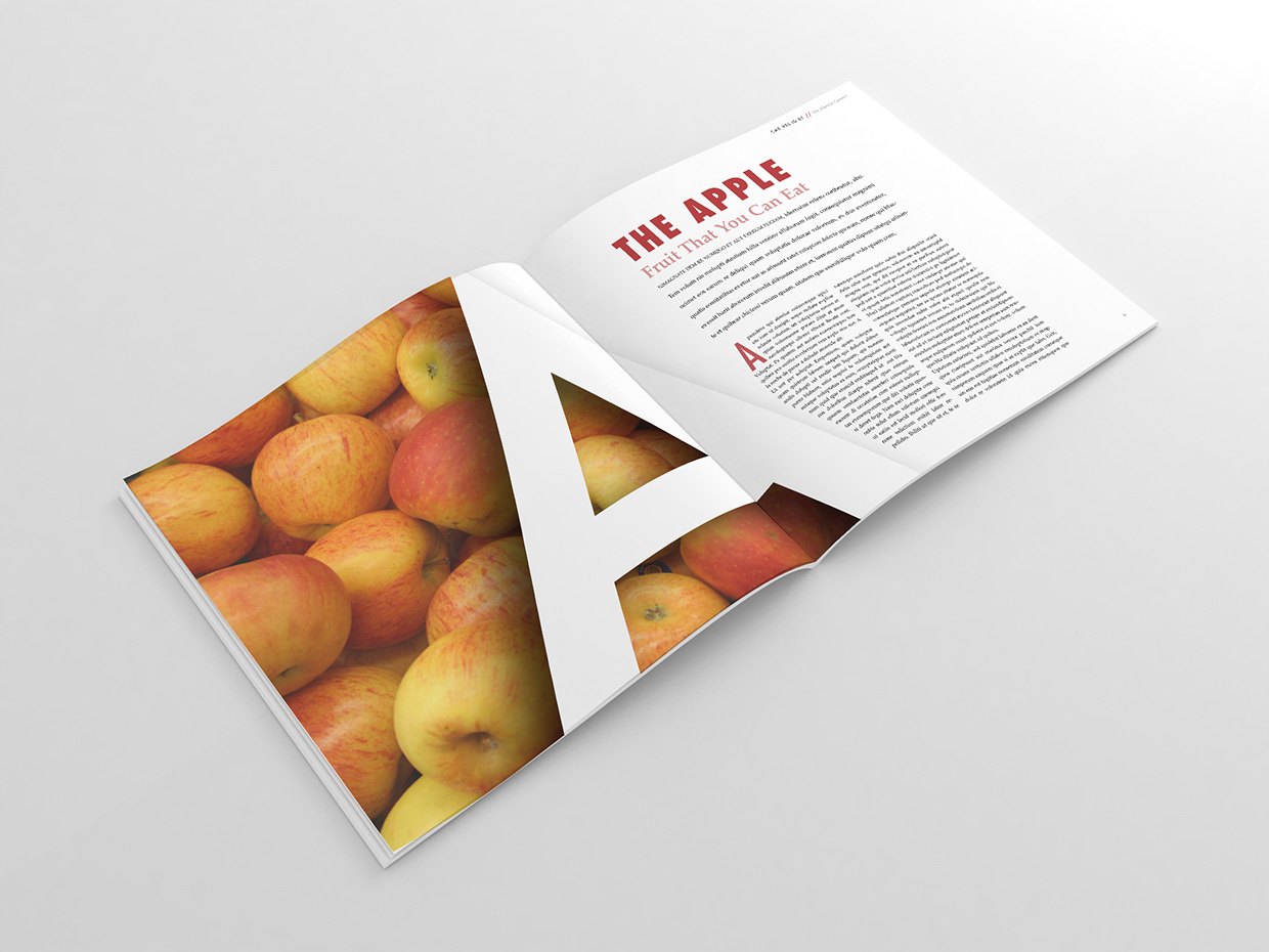
This is a magazine spread that I found on google. I think this spread is a good representation of typography and photography. The simplicity was what attracted me to this particular photo. I underlined the two different types of fonts in this magazine spread. The first in blue is larger, all caps, and in bold.Continue reading “A is for Apple…. a beginners critique of typography and photography.”
Doterra Ad Design
I chose to use this ad by DoTerra for my reverse engineering project. I liked this because the design is simple yet effective. It really made me think about the design qualities and how they were used to make this ad work. Alignment I feel like DoTerra did a good job using alignment. I appreciatedContinue reading “Doterra Ad Design”
