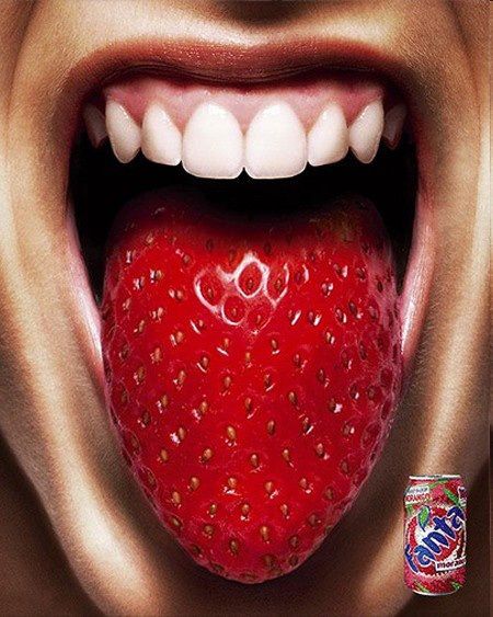
I chose this ad because I liked that it was creative but also sent a message. This product is so good your tongue will taste the fruity flavor. I feel like it was a good use of design and creativity.
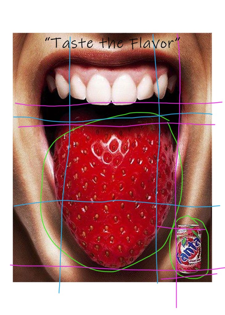
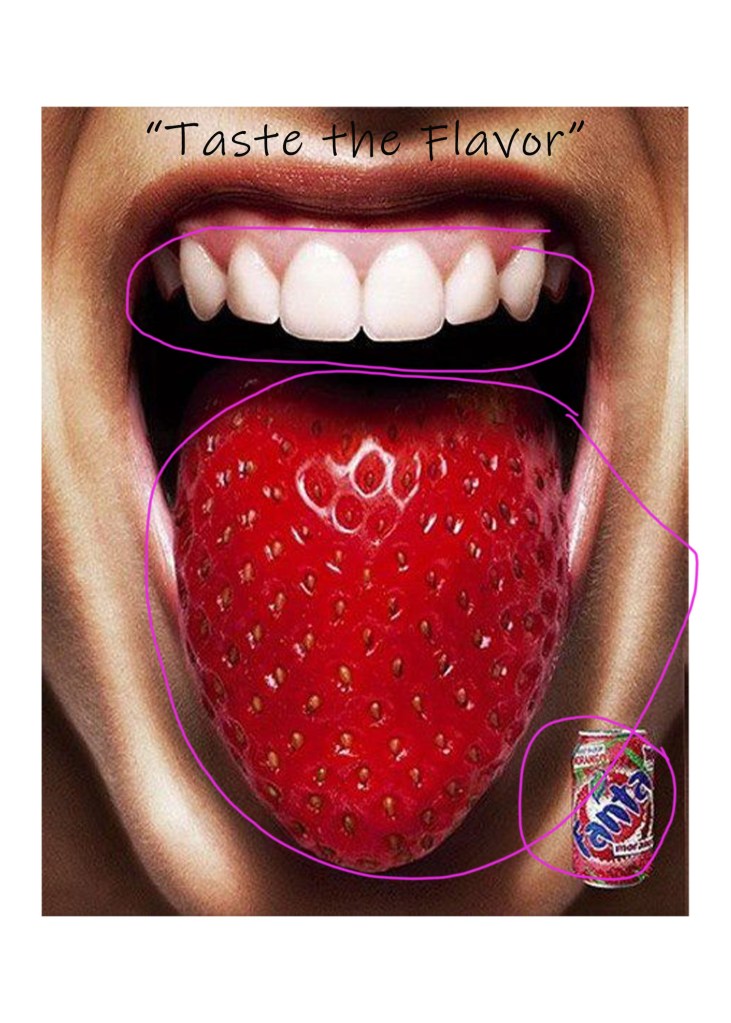
The design of this ad has many different great design elements. It uses repetition in the fruit and cooler of the soda matching the tongue(shown in green). There are many points on alignment as shown in the pink color. The rule of thirds is shown in blue. The picture is divided up well with many elements falling within a box and helping create a good balance.
This shows the good use of color and contrast. The red and white contrast well and make the picture stand out. It unites the Fanta product with the tongue by matching colors.
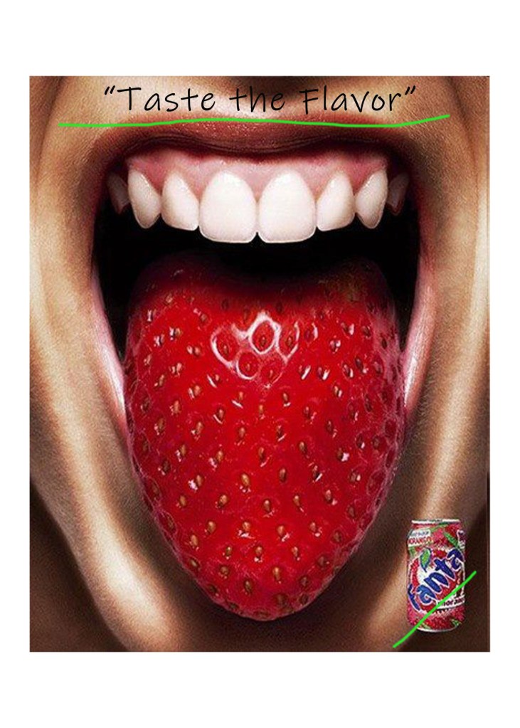
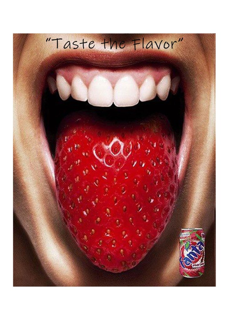
The typography in this ad is not as strong. I like what the text says but isn’t in a very good location, yet I don’t know where else it would work better.
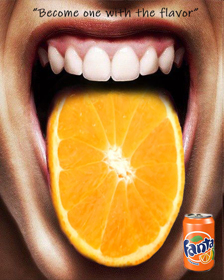
Here is my version of the ad. I tried to make it match the original, yet with a different flavor.
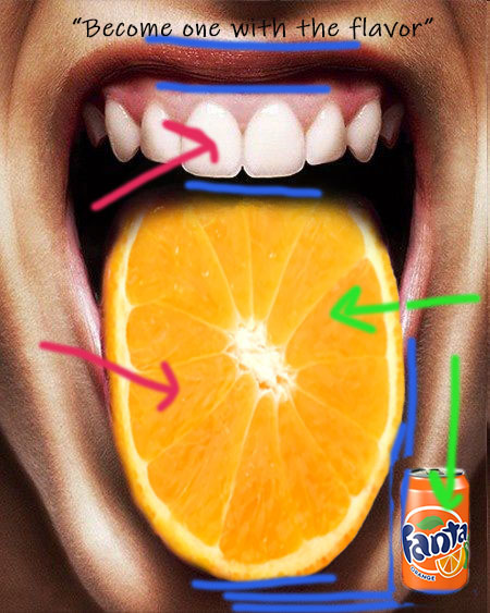
I tried using the same design as the original. I only changed a few things in the design. I chose a slice of orange for the tongue since there is a Fanta in an orange flavor. I found an orange slice with a bright color to contrast with the white of the teeth. I tried to keep everything aligned the same and repeated the orange theme.
I tried to keep the colors bright to contrast the white. I tried to match the orange fruit slice with the orange can.
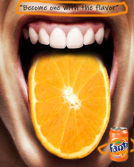
The text of the words goes along with the text of the original ad.
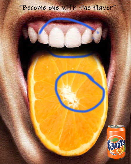
I feel like these ads match well together in the design and the message they portray. The cans match and I feel like they look similar enough to be apart of the same campaign.
