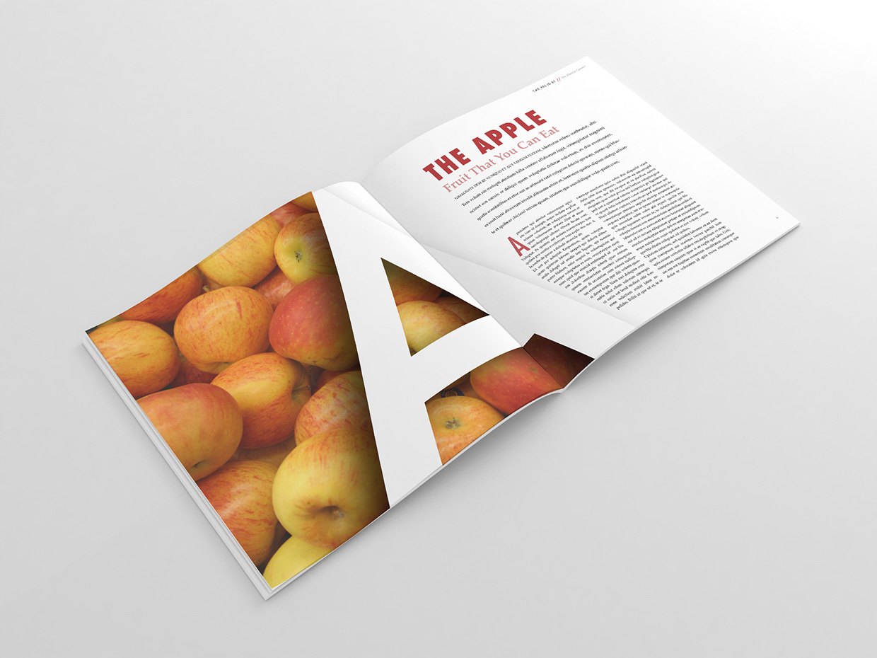

This is a magazine spread that I found on google. I think this spread is a good representation of typography and photography. The simplicity was what attracted me to this particular photo.
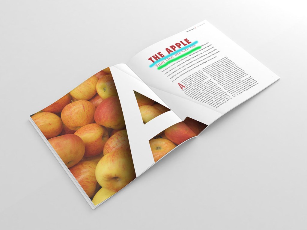
I underlined the two different types of fonts in this magazine spread. The first in blue is larger, all caps, and in bold. The green is smaller uses lowercase letters and is not bold.
The bold larger font is a san serif. You can tell this because there is no thick or thin transition and the lack of serifs. The smaller font is an oldstyle. You can see the serifs are on an angle, especially on the capital T’s. It also has thin to thick transitions.
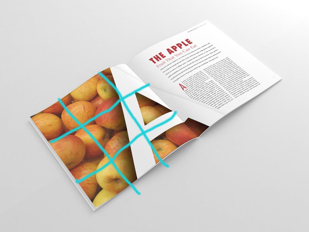
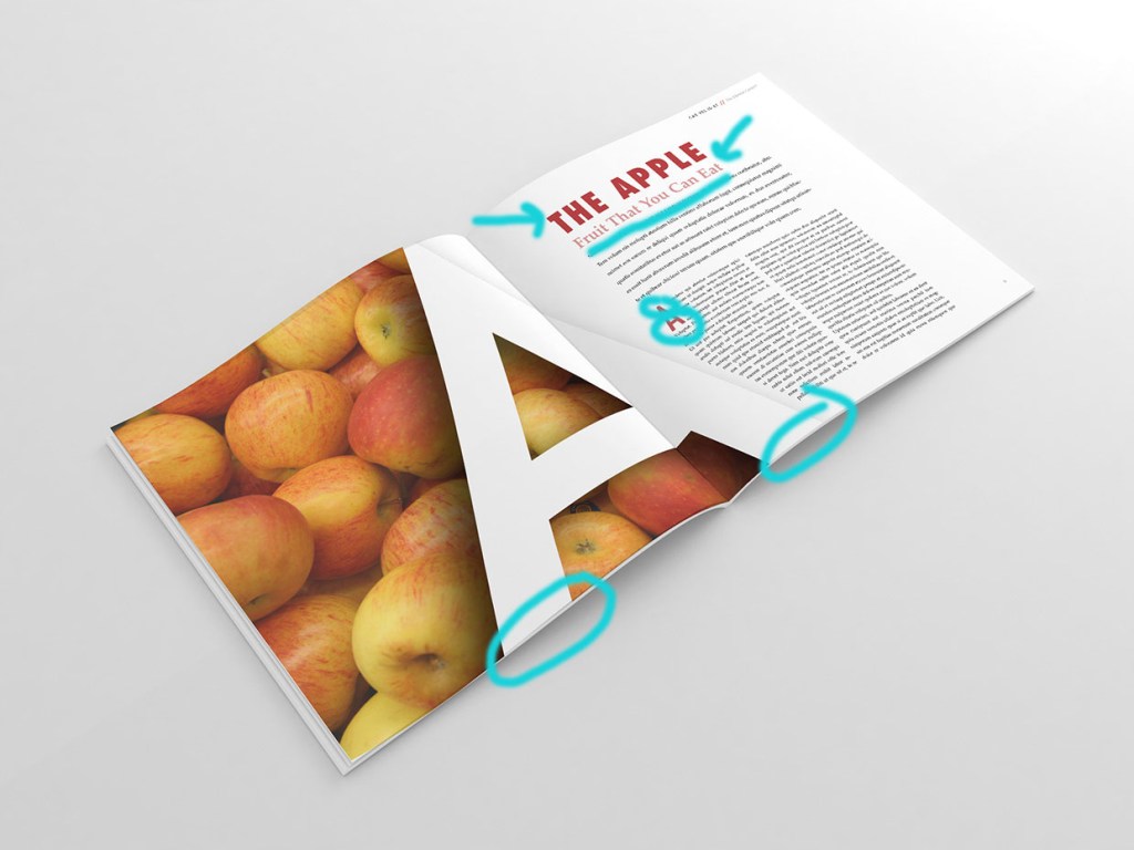
This picture was a little different because it used the big letter A on top of the apples to show the rule of thirds. You can see how most of the A is on the right side. The edges of the A line up along the right vertical line. Both horizontal lines cross along the A as well.
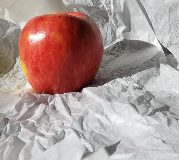
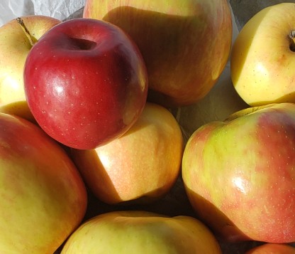
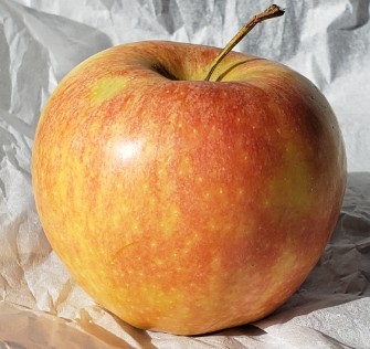
I wanted to stick with the apple theme so I have included these three pictures that could replace the original photo in the magazine spread. All follow the rule of thirds. In the first picture I put the apple in upper left hand corner, opposite of where the big letter A would go. I chose red to contrast with the white of the A. In the middle I tried to recreate the original picture but used a red apple in the corner also following the rule of thirds. Last I have a picture of a single apple. The stem will follow along with the lines of the A, matching up with the leading lines.
Conclusion:
I enjoyed learning more about typography and photography and then using this knowledge to reverse engineer this magazine post. This magazine spread checked all the boxes..followed the rule of thirds, had leading lines, and the fonts were different styles and contrasted well.
