
I chose to use this ad by DoTerra for my reverse engineering project. I liked this because the design is simple yet effective. It really made me think about the design qualities and how they were used to make this ad work.
Alignment
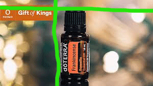
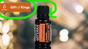
I feel like DoTerra did a good job using alignment. I appreciated that the box of text lined up with the top of the bottle. Then they also lined up the right end of the text box with the left side of the bottle.
Color
The use of color in this picture was subtle yet effective. They matched the color of the bottle to make their text box. The dark color stands out because the colors behind it are softer. They add interest by adding the colors of light. I feel like this makes the text Gift of Kings match because the lights make me feel like somehow this bottle is special.
Repetition
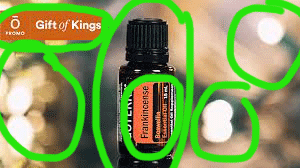
There is a good use of repetition here from the use of the DoTerra logo. Also, the same colors are being used on the bottle and color behind the text.
Proximity
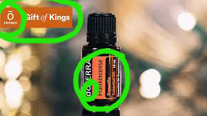
The simplicity of this ad shows how well proximity works in design. The text Gift of Kings is written to the left but slightly above the bottle of oil. It made me think of a crown sitting on top of a king’s head. The bottle is front and center like a king would be without any other unnecessary things around it. It allows it to be the focus of the picture.
Contrast
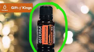
This design has good contrast. The black bottle against the blurry background makes it stand out. This shows that this is the most important part of the ad. They also show contrast by using two different fonts in Gift of Kings.
This was a fun project to reverse engineer. I wanted something simple and this fit the bill. I feel like it was a well-made design and made good use of all the important design aspects. It definitely made me feel like this bottle of essential oil was special.
